Why are your Databricks jobs performances changing over time?

Understanding why your job performance is changing is critical to both optimize costs and prevent crashes. In this post we show a new visualization timeline features to help engineers find root causes quickly

For those running and tracking their production Databricks jobs, many may often see “random” fluctuations in runtime or slowly changing performance over days and weeks.
Immediately, people may often wonder:
- “Why is my runtime increasing since last week?”
- “Is the cost of this job also increasing?”
- “Is the input data size changing?”
- “Is my job spilling to disk more than before?”
- “Is my job in danger of crashing?”
To help give engineers and managers more visibility into how their production jobs are performing over time, we just launched a new visualization feature in Gradient that will hopefully help provide quick answers to engineers.
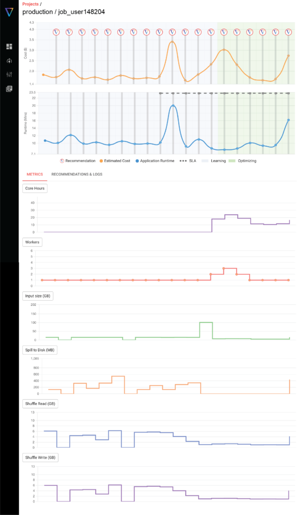
A snapshot of the new visualizations is shown below, where on a single page you can see and correlate all the various metrics that may be impacting your cost and runtime performance. In the visualization below, we track the following parameters:
- Job cost (DBU + Cloud fees)
- Job Runtime
- Number of core*hours
- Number of workers
- Input data size
- Spill to disk
- Shuffle read/write
Why does job performance even change?
The main three reasons why we see job performance change over time are:
- Code changes – Obviously with any significant code changes, your entire job could behave differently. Tracking and understanding how your new code changes impact the business output however is less clear. With these new visualizations, engineers can quickly see the “before and after” impact of any code changes they implement
- Data size changes – When your data increases or decreases, this can impact your job runtime (and hence costs). While this makes sense, tracking and seeing how it changes over time is much more subtle. It may be a slowly varying amount, or it could be very spiky data events with sudden changes. Understanding how your data size impacts your runtime is a critical “first check”
- Spot instances revoking – When spot nodes are randomly pulled during your job execution, it can cause significant impact on the runtime of your job. Since Spark has to essentially “recover” from a worker being pulled, the impact on runtime can be significant. We’ve seen runtimes go up 2-3X simply from 1 worker being pulled. It all depends on at what point the Spot instance is being pulled and the impact. Since this is basically random, your overall spot runtimes can have wildly varying runtimes.
As a side note, we’ve observed that an optimized on-demand cluster can often beat Spot pricing because of this very reason. Over the long haul, a stable and optimized on demand cluster is better than a wildly varying Spot cluster.
How does this feature differ from Overwatch?
For those in the know, Overwatch is a great open source tool built by Databricks to help plot all sorts of metrics to help teams monitor their jobs. The main differences and advantages of the visualizations we show are:
1) Total cost metrics – Gradient pulls both the DBU and estimated Cloud costs for your clusters and shows you the total cost. Cost data from Databricks only includes DBUs. While it is possible to wrap in cloud costs with overwatch, it’s a huge pain to set up and configure. Gradient does this “out of the box”
2) “Out of the box” Ready – While Overwatch does technically contain the same data that Gradient shows, users would still have to write queries to do all the aggregations properly by pulling the task level or stage level tables as required. Overwatch is best considered a “data dump” and then users will have to wrangle it correctly and do all the dashboarding work in a way that meets their needs. Our value add is that we do all this leg work for you and just present the metrics from day 1.
3) Trends over time – Gradient aggregates the data to show users how all these various metrics are changing over time, so users can quickly understand what has changed recently. Looking at a single snapshot in time is often not very useful, as users need to see “what happened before?” to really understand what has changed and what they can do about it. While technically this is do-able with Overwatch, it requires users to do the work in building and collecting the data. Gradient does this “out of the box”
How does this help with stability and reliability?
Beyond cost efficiency, stability is often a higher priority than everything. Nobody wants a crashed job. These metrics help give engineers “early signals” if their cluster is headed towards a dangerous cliff. For example, data sizes may start growing beyond the memory of your cluster, which could cause the dreaded “out of memory” error.
Seeing how your performance is trending over time is a critical piece of information users need to help prevent dangerous crashes from happening.
Conclusion
We hope this new feature makes life a lot easier for all the data engineers and platform managers out there. This feature comes included with Gradient and is live today! We’d love your feedback.
It probably goes without saying that this feature is in addition to our active optimization solution that can auto-tune your clusters to hit your cost or runtime goals. The way we look at it, is we’re expanding our value to our users by providing critical metrics.
We’d love your feedback and requests for what other metrics you’d love to see. Try it out today or reach out for a demo!
 Noa Shavit